

I know this concept is quite old-fashioned by now, and I am personally quite taken by a modern scandinavian all-white finish. However, the bikes are being stored on the wall - as I mentioned in my previous post post - and I'm certain bikes and white don't mix well.
I wonder how on earth the apartment dwellers cope? My bike drags in half of Berkshire every time I go for a ride; today, I found a twig folded up in my tea towel. It was just resting there, wrapped up like a deciduous baby jesus. Hmm.
Anyway, we decided to make the bike wall into a 'feature wall' because A) the bikes are going to be a pretty big THING anyway and B) I'm hoping that we can put a nice dark colour on there and it'll hide a multitude of sins (read; dirt and scuffs. I've had mixed feedback on this. Someone told me it was going to end up being a 'rainy cloud room'. Another person told me it would make the room look small - we already do have a tiny dining room. Well, I'm not afraid of dark colours. Anyway, I've seen it done well in other small spaces...
My main source of inspiration is from the amazing Carrie Clarke, whose choice of Dulux's Bowler Hat was total perfection. She made such a bold choice to go for such a dark grey against pure white, but I think it works. Her living room is quite large but it shows how effective these tones can be on an archaic, older home. It really makes things pop.
 | ||
| source |
 |
| source |
 |
| source |
I also took a few more ideas from Pinterest....
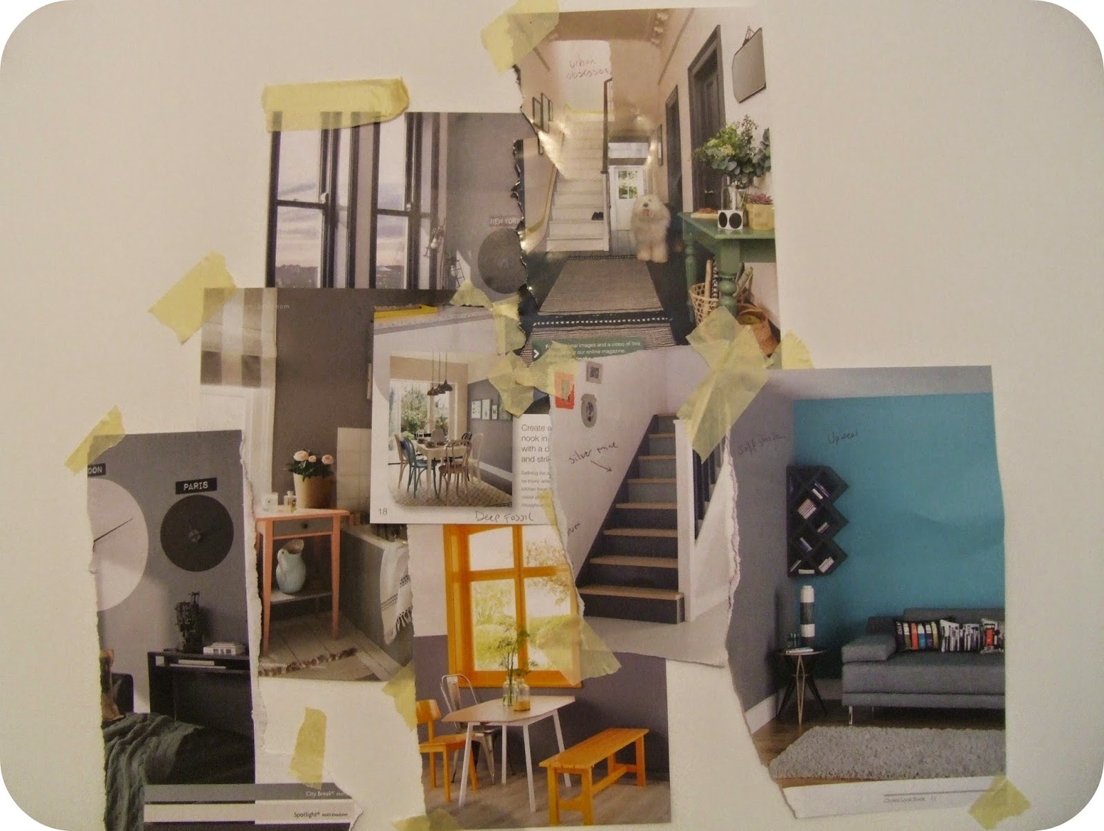
We also perused a few paint catalogues (Dulux and Crown) and made a nice little mood board which I think reflects the look we want. Dark, sophisticated, but with a playful pop of colour.
I want to utilise dark colours to emphasise the light and bright details of the fireplace, which has been painted white by previous owners/tenants.
Then, we spent around two hours choosing paint. OH MY GOD it's so hard. Also, not cheap. Seriously, £3.99 for a Farrow & Ball tester pot? Are you laughing? The rest were between £1.50 and £2.30 each, which was better but still added up.
In order to stick to budget, we picked just eight colours. I was really sad to find that the Bowler Hat shade is not available at Homebase. We chose the closest counterparts, and also went for a few stronger blues.

In terms of quality, the Dulux paint went on the best - and the tester pot had a little brush inside it, which was really very convenient! The coverage was fantasic, too; I gave all samples two coats but really it only needed one.
The Crown paint also had a very smooth application, although the squeezy tester 'tubes' felt quite amateurish and were distinctly more fiddley. I was happy with this coverage and I really liked the colours they had.
I was least impressed wih Farrow & Ball. For the price, and product positioned as the premium brand, I expected a lot. I felt that the paint was too watery and needed more than two coats for a decent coverage. At around £50 a tin, that's not on!
Finally, Homebase's own brands (Blue Slae & Aegea) were also very good value for money - they didn't quite match up to Dulux or Crown but are excellent on the affordability front. They certainly get the job done.
I still haven't made up my mind.... maybe tomorrow?
I'd love to hear your thoughts!
Sarah
The Yup Blog
No comments:
Post a Comment